
Logo colors: how to choose and what they say about your brand
People notice colour before they read a name. It shapes how customers perceive price, quality and character. Here's how to choose a logo colour deliberately – not just because you like it.
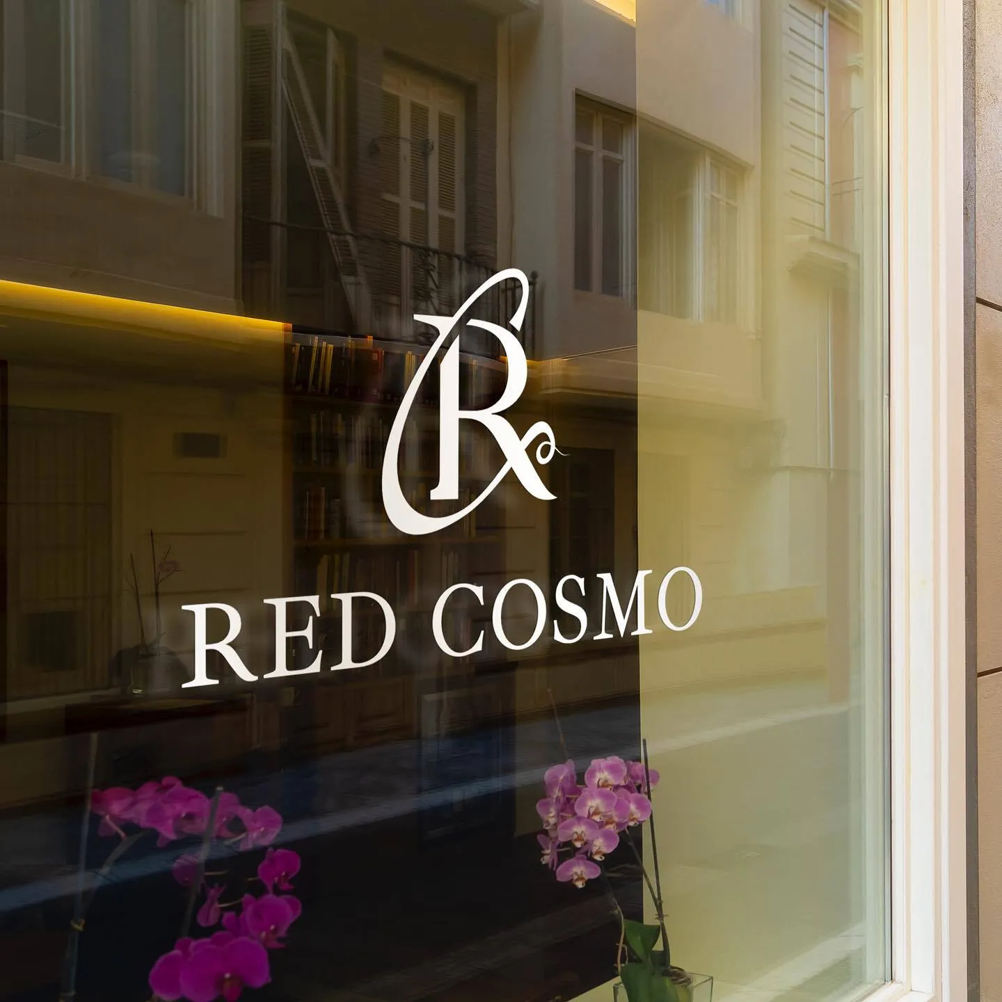
When someone sees a logo, they react to the colour first and only then to the shape and name. Colour hints at whether something is cheap or premium, serious or playful, natural or high-tech. That's why choosing a logo colour isn't a matter of the owner's taste – it's a decision that affects sales.
Here's how the main colours work, how many you need and what to check so your logo colour looks equally good on a sign, on Instagram and on printed packaging.
- Choose a logo colour by the feeling your brand should create and by how you'll stand out from competitors.
- One or two core colours plus a one-colour version for print and foil is the sweet spot.
- At BOMBA DESIGN we match colours to your audience and show them on visualisations before you approve.
MeaningWhat colours mean in a logo
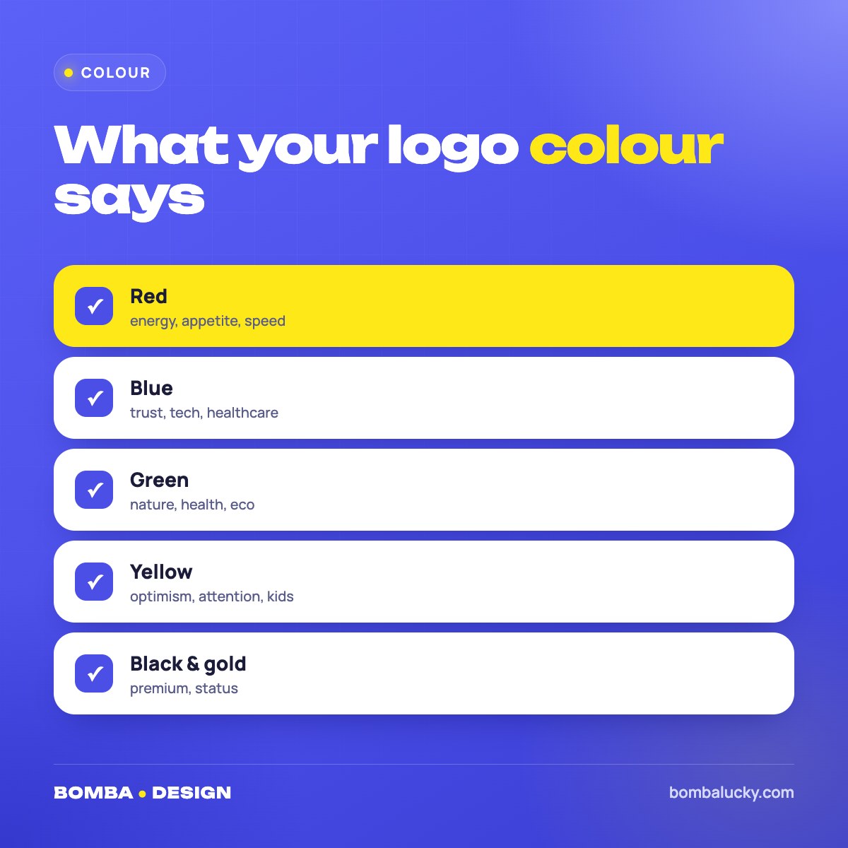
Red – energy, passion, appetite, speed. It grabs attention first, which is why food businesses, delivery services and bold beauty brands love it.
Blue – trust, calm, professionalism. The most common colour in finance, healthcare, tech and construction – which also makes it hard to stand out with blue alone.
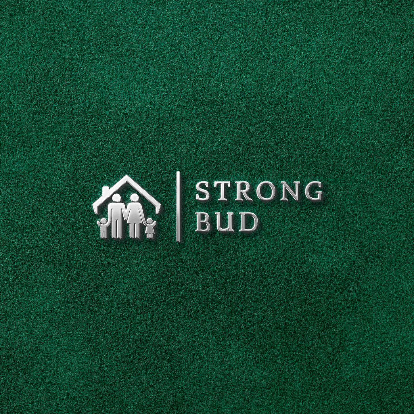
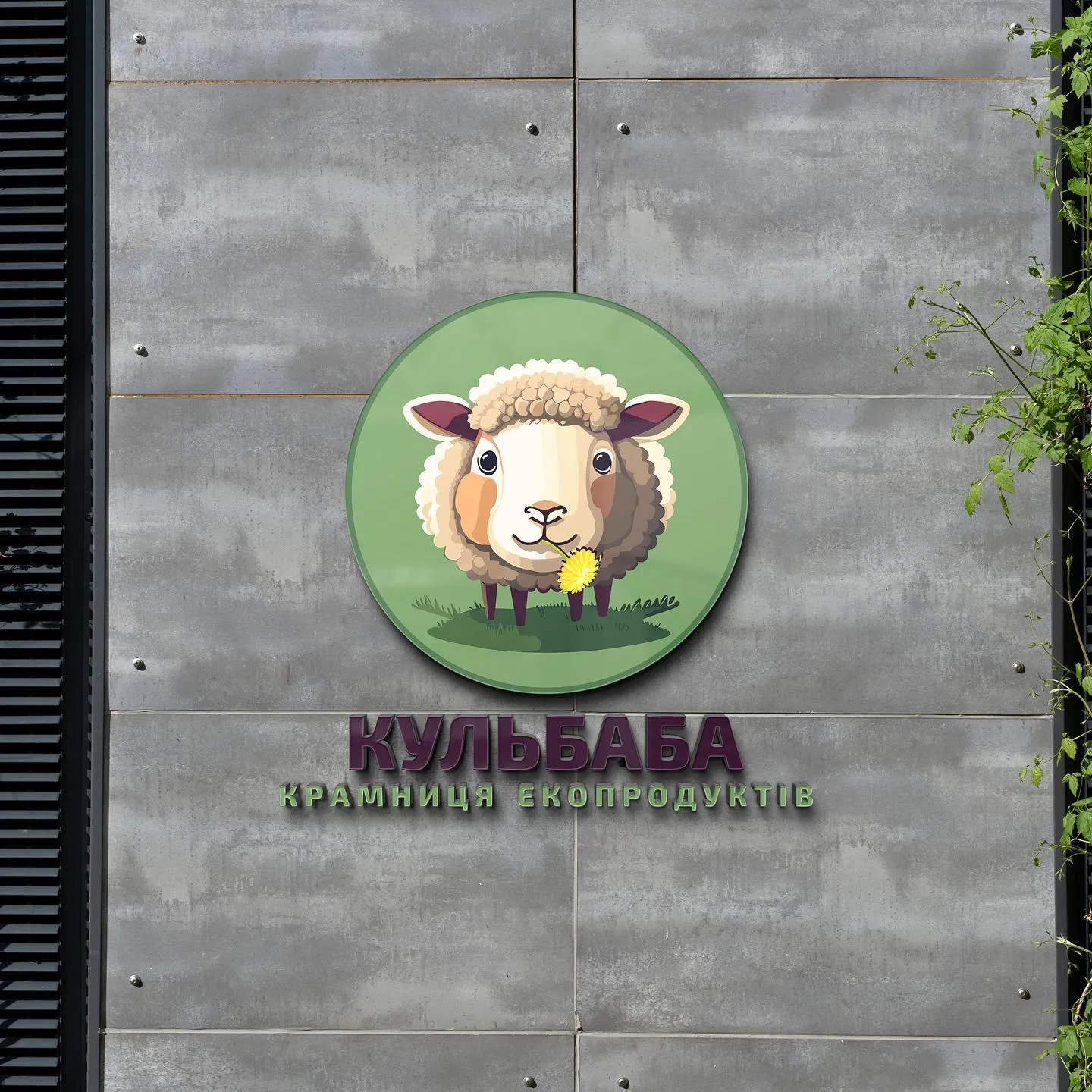
Green – nature, health, sustainability, growth. A natural fit for eco products, vets, landscaping and residential building.
Yellow and orange – optimism, warmth, approachability. Great for kids' brands, cafés and services, but they need a contrasting partner to read on white.
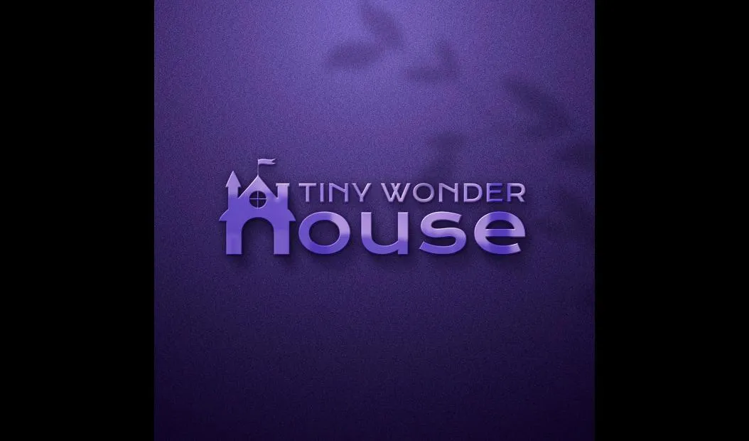
Purple – creativity, originality, premium feel. It helps young brands stand out from conservative competitors.
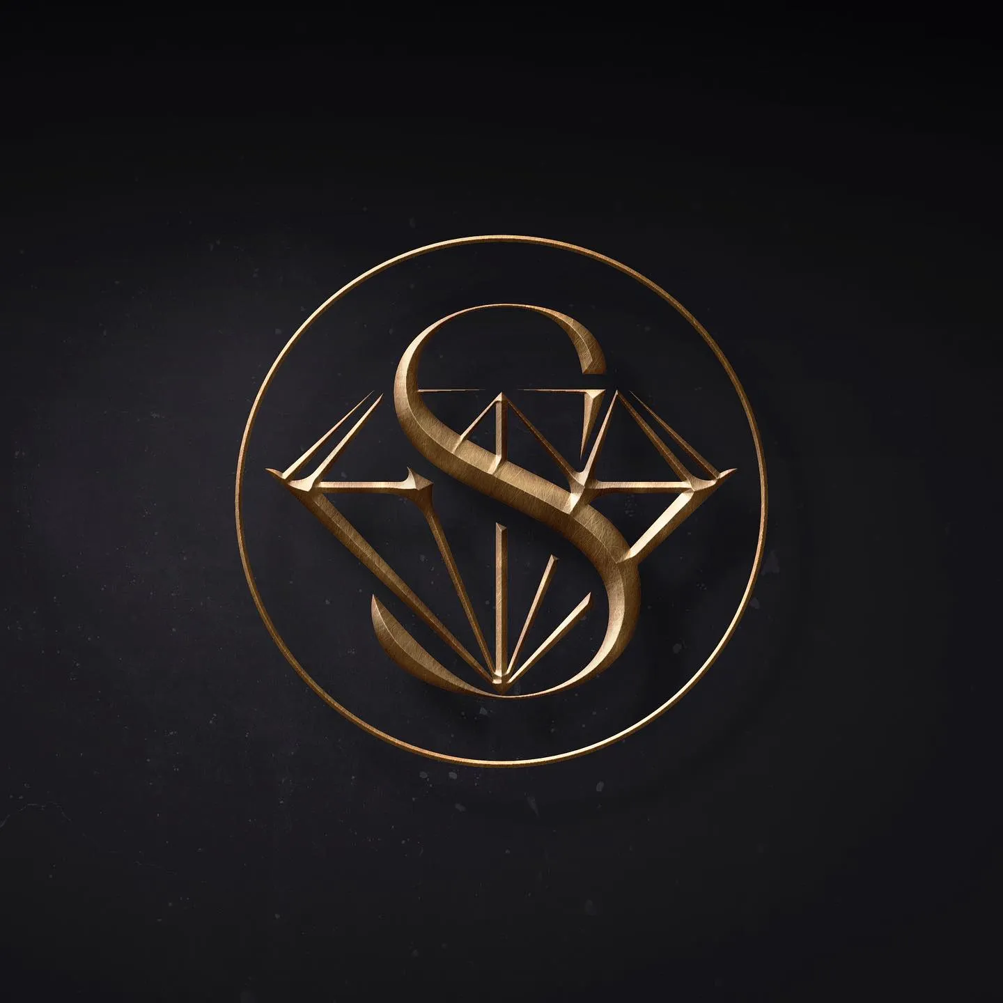
Black and gold – status, elegance, luxury. A classic for premium salons, fragrance, jewellery and law firms.
How manyHow many colours a logo should have
The strongest logos usually use one or two colours. Every extra colour complicates printing, raises signage costs and dilutes recognition. If your brand needs a vivid palette, move it into the wider identity – backgrounds, illustrations, packaging – and keep the mark itself simple.
| Colours | Pros | Cons |
|---|---|---|
| 1 colour | Maximum recognition, cheap printing | Needs a strong shape |
| 2 colours | Balance of character and simplicity | Check the contrast |
| 3+ colours | Vibrant, playful | Costlier print, tricky on fabric |
ChoosingHow to choose your logo colour
- Start with a feelingWrite down three words customers should think of – “reliable, warm, fast”. The colour should support them.
- Look at competitorsIf everyone in your niche is blue, another colour gets you noticed. If everyone is loud, restraint stands out.
- Consider your audienceKids, teens, business clients and seniors respond to colour differently.
- Test it on touchpointsColour looks different on screen, in print, on kraft and on fabric – which is why visualisations are essential.
One more tip: don't pick a colour just because it's this year's trend. Trends change every season, but a logo should last for years. Use trendy shades in ads, stories and seasonal collections, and keep your core logo colour stable – consistency is what makes a brand recognisable.
TechnicalColour on screen and in print
The same colour is defined differently for different media: RGB and HEX for screens, CMYK for print, Pantone for precise packaging and fabric printing. Without these codes, every printer picks the shade by eye, and your red on the sign won't match your red on business cards. That's why it pays to have a vector logo and fix your brand colour codes – more in vector logo files.
ProcessHow we choose logo colours
In the brief we ask which colours you like and which are off-limits, who your customers are and which colours competitors use. If you already have a sign, interior or packaging, we ask for photos so the new mark fits in. Each concept is shown in its main colour, in one colour and on a dark background – on a sign, as an avatar and on packaging – so you see colour in real conditions. Changing a shade is a normal revision. Step by step in how to order a logo; to prepare, read logo design brief.
PricesHow much a logo with colour selection costs
Colour selection is part of every concept
Changing the colour of an approved concept is a normal revision within your limit, not a new variant – so feel free to experiment with shades. More in how much a logo costs.
Customers may forget your name. They'll remember your colour first.
If you're planning a vivid palette for the whole brand, also read about brand identity and why the strongest marks are often minimalist.
FAQFAQ
How do I choose a logo colour?
Start from the feeling your brand should create, your audience and your competitors' colours. Test the colour on real touchpoints.
How many colours should a logo have?
Ideally one or two core colours plus a one-colour version for print and foil stamping.
Can I change the colour after choosing a concept?
Yes, changing a colour is a normal revision within your package limit, not a new logo variant.
Which files will I receive?
Vector CDR, EPS, PDF and raster PNG, JPG – for screens and print.
Fill in the brief – we'll match colours to your audience and show them on your touchpoints.
Fill in the briefPackages & pricesHigh quality
Years of experience let us take on projects of any complexity
Individual approach
Every client is unique. We create a unique concept for each of them
Professionals
Everyone on our team has extensive experience in advertising, development and design
Fast turnaround
Logo design takes 2–8 business days
GET IN TOUCH
Message us on Telegram, Instagram or by email – we reply quickly and gladly.