
Logo redesign: how to tell it's time for a change
The logo you launched with doesn't have to stay with you forever. When a new mark pays off, when it's just an expense, and how to change your logo without losing recognition.
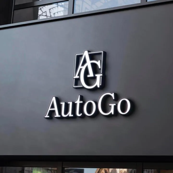
Most small-business logos are born in a hurry: an evening with a generator, a favour from a friend who “does design”, or the last day before opening. While the business is small, that's fine. But there comes a moment – a second location, a new market, higher prices – when the old mark starts holding you back. That's when a logo redesign becomes a real question.
Rebranding isn't a whim or a trend. A well-executed redesign helps a business look worthy of its prices, stay recognisable on new touchpoints and finally own a mark it can register. A badly executed one confuses loyal customers. Here's how to get the first outcome and avoid the second.
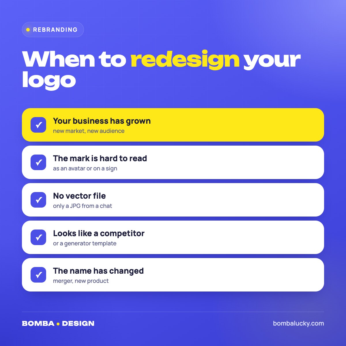
- Redesign your logo when the business has grown, the mark is hard to read, there's no vector file, or it resembles someone else's.
- A refresh keeps recognition and modernises the mark; a full rebrand creates a new identity from scratch.
- A new logo from BOMBA DESIGN starts at €110 / $115 and takes from 2 working days, with visualisations on your touchpoints.
SignsFive signals your logo is outdated
The business grew, the logo didn't. You started as a home bakery and now run a café with a kitchen. A mark that suited a small project no longer matches your scale or price level.
It doesn't read on modern touchpoints. Fine details, thin lines and gradients blur in an Instagram avatar, on Google Maps and as an app icon. If a logo needs explaining, it isn't working.
There's no vector file. The logo only exists as a JPG, and every printer redraws it differently. The result: different versions of one mark on your sign, cards and bags.
It looks like someone else's. A generator template or “inspiration” from a famous brand blocks trademark registration and makes you look like dozens of other businesses.
The name or direction changed. A merger, a new product, expansion abroad – your logo should reflect who you are now.
OptionsLogo refresh or full rebrand
| Refresh | New logo | |
|---|---|---|
| What changes | Type, proportions, colours, details | The whole idea of the mark |
| Recognition | Kept | Rebuilt |
| Best when | The mark basically works | The mark doesn't fit the business |
| Risk for customers | Minimal | Announce the change |
| Result | A modern version of a familiar mark | A new brand image |
If customers know your mark well and it broadly captures your business, a refresh is the smarter move: update the typeface, simplify the shape, fix proportions, and prepare versions for dark backgrounds and small sizes. If the logo was random from the start, creating a new one from scratch pays off more.
ProcessHow a logo redesign works
- Audit. We look at what already works in the old mark: colour, shape, associations customers remember.
- Brief. You tell us what changed in the business, who your customers are now and where you're heading.
- Concepts. The designer prepares options – from a careful refresh to a bold new direction – and shows them on your touchpoints.
- Revisions and files. We polish the chosen option and deliver vector CDR, EPS, PDF and raster PNG, JPG.
More on the steps in how to order a logo. Before the brief, collect photos of everywhere your old logo lives: sign, packaging, website, social media. That shows the designer exactly what they're working with.
PricesWhat a new logo costs
A redesign is a new logo from scratch
For a redesign we recommend two or three concepts: one careful option close to the old mark and one bolder. You see both paths and choose with confidence. Full breakdown in how much a logo costs.
LaunchHow to switch logos without losing customers
- Tell people about itA post, stories and an email explaining why you changed turn the rebrand into news.
- Switch touchpoints in orderDigital first – avatars, website, Google Maps – then signage, packaging and print.
- Keep something familiarA colour, letter or signature shape, so regulars recognise you instantly.
- Update every fileSend the new vector to printers, designers and contractors. Why it matters – in vector logo files.
A rebrand works when a regular notices things got better – but never feels they walked into a different place.
If you plan to refresh your whole look along with the logo, read about brand identity and the logo design mistakes worth avoiding.
FAQFAQ
When does a logo need a redesign?
When the business has grown, the mark is hard to read on modern touchpoints, there's no vector file, it resembles another logo, or the name or direction has changed.
What's the difference between a refresh and a rebrand?
A refresh updates the existing mark and keeps recognition. A full rebrand creates a new logo from scratch.
How much does a new logo cost?
At BOMBA DESIGN, from €110 / $115 for one concept to €185 / $190 for four.
Will I lose customers after changing my logo?
Not if you announce the change, update touchpoints in order and keep a recognisable element of the old mark.
Fill in the brief and attach your current logo – we'll suggest redesign options.
Fill in the briefPackages & pricesHigh quality
Years of experience let us take on projects of any complexity
Individual approach
Every client is unique. We create a unique concept for each of them
Professionals
Everyone on our team has extensive experience in advertising, development and design
Fast turnaround
Logo design takes 2–8 business days
GET IN TOUCH
Message us on Telegram, Instagram or by email – we reply quickly and gladly.