
How to find a Pantone colour from an image or a logo
One blue on the website, a purplish one on business cards, a third on the sign. Why that happens, what Pantone solves and how to find the nearest number for your colour.
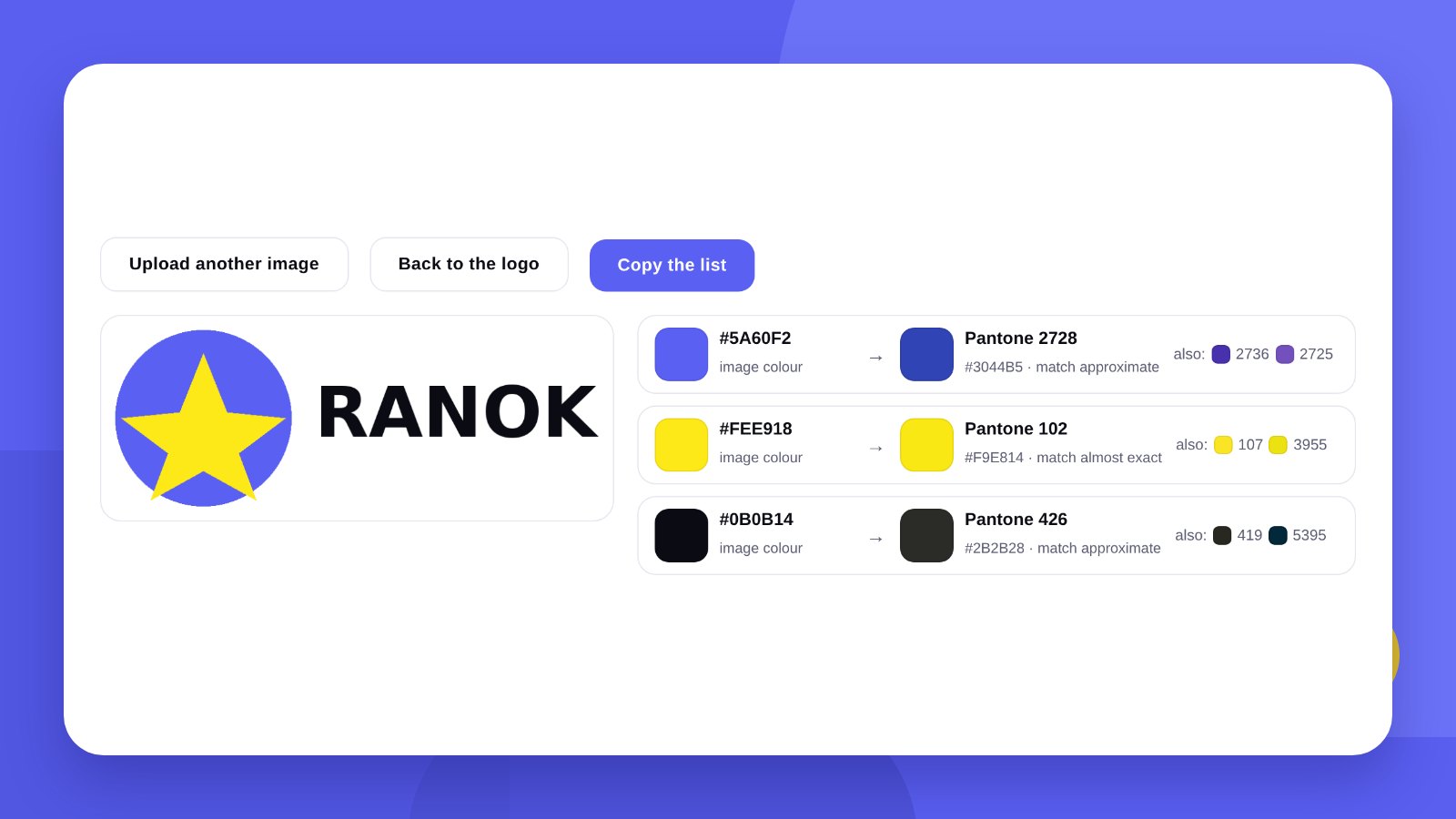
The brand blue is one shade on the website, slightly purple on business cards, lighter on the sign and different again on T-shirts. That is not carelessness on the part of contractors: every device and every material reproduces colour in its own way. Pantone was invented precisely so that everyone talks about the same colour.
Pantone is a catalogue of ready-mixed inks with numbers. A print shop does not mix the colour from four base inks; it takes a specific ink by its number. That is why Pantone 286 C looks the same in Kyiv, Warsaw and Berlin.
- HEX and RGB are for screens, CMYK for ordinary print, Pantone for an exact colour on any material.
- You can find the nearest number from a picture, but the final colour is checked against a paper fan deck.
- Pantone is needed for signs, packaging, textiles, merchandise and long print runs.
BasicsHEX, RGB, CMYK and Pantone: the difference
| System | Where it is used | How it is written |
|---|---|---|
| HEX / RGB | Website, social media, presentations | A code such as #5A60F2 |
| CMYK | Business cards, flyers, catalogues | Percentages of four inks |
| Pantone | Packaging, signs, clothing, merchandise | A catalogue number, for example 2726 C |
| RAL | Painting metal, facades, furniture | A four-digit number |
One brand colour has a notation in each system. That list is exactly what makes up the “Colours” page of a brand book.
How-toHow to match Pantone from an image: 3 steps
- Upload a logo or a pictureOpen Pantone from image. Any image will do: a logo, a photo, a screenshot.
- Choose the colourThe tool shows the main colours, or click the exact spot you need.
- Copy the numbersThe list of Pantone numbers with HEX codes can be sent to the print shop.
PracticeWhen Pantone is really needed
- Packaging and labelsThe colour must match from run to run, otherwise the product on the shelf looks like two different brands.
- Signs and vinylCutting vinyl is chosen from the manufacturer’s catalogue; a Pantone number helps to find the nearest one.
- Clothing and merchandiseScreen printing and pad printing work with ready-mixed inks, not a CMYK mix.
- Bright coloursCMYK reproduces rich orange, neons and metallics dully. Pantone reproduces them exactly.
- One- or two-colour printA letterhead or a bag in one brand colour is cheaper to print with a single Pantone ink.
For business cards and flyers printed digitally, Pantone is usually not needed: those presses print in CMYK, and the number serves only as a reference for setting up.
AccuracyWhy colour differs on screen and on paper
A screen glows. A monitor shows colour with light; paper shows it with light reflected from ink. A perfect match does not exist.
Every screen lies in its own way. The same HEX looks different on a phone and on an office monitor.
Paper changes the colour. That is why Pantone has two main series: C (coated) for glossy coated paper and U (uncoated) for uncoated paper. The same number looks paler on matt paper.
Hence the order of work: find the nearest numbers from a picture → show them to the print shop → check against a paper Pantone fan deck → approve one number and write it down.
MistakesCommon mistakes with a brand colour
The colour was taken from a screenshot. JPG compression shifts the shade. Take the colour from the original logo file.
The colour is matched “by eye” every time. Each contractor picks it differently – and a year later you have five different blues.
One number for every material. The same Pantone looks slightly different on vinyl, fabric and paper. Ask for a sample.
Nothing is written down. The colours must be recorded in one document. You can put one together in a few minutes in the Mini brand book in PDF tool.
ToolWhat a Pantone fan deck is and whether to buy one
A fan deck is a catalogue of thin paper strips printed with the real inks and their numbers. It is the only way to see how a colour really looks rather than how a screen shows it.
A small business does not need to buy one: every print shop and every designer has a fan deck. It is enough to come once, choose a number from those suggested and write it down.
Fan decks fade: the ink grows paler over the years. If a print shop shows you a battered ten-year-old catalogue, the colour on it is no longer the same.
PracticeHow to talk to a print shop about colour
- Give a number, not “blue like on the website”Pantone 286 C is unambiguous. “A rich blue” means something different to everyone.
- Say what you are printing onCoated paper, kraft, vinyl, fabric. The series and the result depend on it.
- Ask for a colour proofA test print before the run. For large orders this is standard practice.
- Keep a sampleA successful run is the best reference. Show it to the print shop next time.
- One print shop, one resultWhen you change contractor, approve the colour against the sample again.
HonestlyThe tool gives a reference. Colours for print are chosen by a designer
The tool finds the nearest Pantone numbers for a colour on screen. The values are approximate and taken from open tables: it is a prompt for a conversation with the print shop, not an approved brand colour.
Choosing a palette that looks equally good on screen, paper and a sign, and recording it in every system, is part of the work on a brand identity. We do it together with the logo: logo design.
A Pantone number matched from a screen is a starting point, not the final answer. Approve a colour only against a printed sample.
FAQFAQ
How do I convert HEX to Pantone?
There is no exact conversion: you look for the nearest number. Upload a picture with that colour and the tool shows the nearest Pantone colours.
What do the letters C and U after the number mean?
C is for coated (glossy) paper, U for uncoated. The ink looks different on different paper.
Will Pantone match the colour on screen?
Approximately. The final colour is checked against a paper Pantone fan deck at the print shop.
Do I need Pantone for business cards?
For digital print usually not; CMYK is enough. Pantone matters for offset, packaging, signs and textiles.
How many brand colours should there be?
Usually one or two main ones and one or two secondary. The fewer colours, the easier it is to keep them consistent.
Where do I record brand colours?
In the brand book: HEX, RGB, CMYK and Pantone for each colour.
We will design a brand identity and a brand book: colours in every system, fonts and rules for using the logo.
Match PantoneLogo designHigh quality
Years of experience let us take on projects of any complexity
Individual approach
Every client is unique. We create a unique concept for each of them
Professionals
Everyone on our team has extensive experience in advertising, development and design
Fast turnaround
Logo design takes 2–8 business days
GET IN TOUCH
Message us on Telegram, Instagram or by email – we reply quickly and gladly.